Eng-Tips is the largest engineering community on the Internet

Intelligent Work Forums for Engineering Professionals

3D Scatter Plot 1

Status
Not open for further replies.

Sparweb

Aerospace
May 21, 2003
5,103
0
36
CA
Hello,
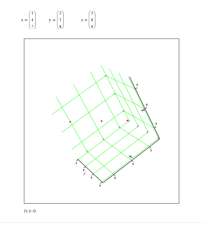
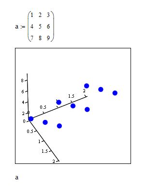
I have been trying to create a scatter plot - the obvious way to create one is a surface "z" as a function of two variables "x" and "y", but that's not what I want to do. I have a 3-dimensional data set and I just want to see it. The Mathcad graph "3D Scatter Plot" isn't giving me what I am looking for.

My dataset has thousands of points. For extreme simplicity I will demonstrate my problem with 3 points, by giving you their XYZ coordinates:

1,2,3
4,5,6
7,8,9

To my mind, that is 3 points. 3D Surface Plot puts 9 points on the graph. It seems to be mistaking the row and rank of the matrix with data. If the row and rank were important, I would use that, but they aren't. Should I be using some other kind of chart to plot this?
I have reconfigured the inputs for this graph as vectors, matrices, and entered them separately as vectors for each coordinate, to no avail.

A file is attached. Mathcad 13 or earlier, please.

3D_Scatter_kbllh8.jpg

 
Replies continue below

Recommended for you

What do the brackets you put around x,y,z have to do with the presentation of the result?

Anyway, thank you - I don't know why, but it works.
 
As usual Mathcad's Help is a obtuse; nevertheless, the 3D plot is one of the few things that Mathsoft dig well in Mathcad, and is actually better than the comparable facility in Excel which uses a dumb as dirt dialog box to change orientations.

3D_akgbjq.png


TTFN (ta ta for now)
I can do absolutely anything. I'm an expert! faq731-376 forum1529 Entire Forum list
 
It has been a long time since I have done anything in MathCad, but those brackets around the values make those numbers into vectors in MathCad so they can be used in Matrix processing. I hope that helps in answering your question.


Jim


Well now that it works, here's what I wanted to do. Knowing the trick and I did get the thing plotted in 10 minutes like I wanted to.

The plot compares the measurement from a current sensor in various conditions. The current produced by the generator should be zero up to a certain speed threshold, then increase linearly at higher speeds. At different temperatures the sensor's sensitivity seems to change, but I wasn't sure. I wanted to spend 10 minutes exporting the data table from Excel to Mathcad and plot the 3d scatter to see it. Little did I expect it to take 2 hours doing consistently the wrong thing in MC. Which is about as long as it would have taken to do it normally in Excel but hey I'm still a MC fan despite its quirks.

Visualizing the data made it clear that the trends are hard to see in the hash of values from the current sensor. That in itself is annoying, and could be a good reason to choose a different sensor for this job. There may also be too much noise from something else in the system. I didn't even think of it at the time, but now I want to add at least a capacitor from Vcc to Ground on the sensor to see if that helps.

3D_Scatter_fixed_tuewfw.jpg
 
A surface plot might be more apropos. Nevertheless, the trends appear to partially support your statements, but the bigger issue is that the data doesn't appear to cover the threshold conditions particularly well in some cases, or not at all, and in other cases, it doesn't cover the current rise vs. rpm slope regime. Note that copper resistivity is temperature dependent, so some variation with temperature would be expected, even if the sensor was thermally stable.

TTFN (ta ta for now)
I can do absolutely anything. I'm an expert! faq731-376 forum1529 Entire Forum list
 
Status
Not open for further replies.
Back
Top