Eng-Tips is the largest engineering community on the Internet

Intelligent Work Forums for Engineering Professionals

How to make time-at-level curve in Excel? (for dummy injury evaluation)

Status
Not open for further replies.

scoutfai

Aerospace
Jan 24, 2010
4
0
0
MY
I need to evaluate and correlate between sled test dummy injury criteria (e.g. NIC) with CAE simulation result. To do this I need to plot something called time-at-level curve from the raw data out of simulation.

For an detail explanation of what time-at-level is, please have a look at the following link:

Link

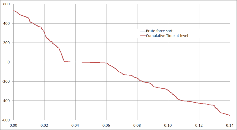
The post-processor software META has both the continuous and cumulative time-at-level function, so it is pretty straight forward to produce such curve in META.
In Hypergraph, there is a function called time-at-level however it will not produce a curve that consistent with the definition given in the link above, which is also the definition used by various NCAP.

The problem I have now is, my client does not have META, and inquire us how to produce the time-at-level curve, using simple software like Microsoft Excel, if he can extract the raw data (e.g. force vs time).

I have been trying to search how to achieve this in Excel but with no success. I knew that the function FORECAST, together with OFFSET and MATCH in Excel will be able to give linear interpolation of a curve, but it only gives 1 point and stops there.
What I mean is, in the case of time-at-level, says for example the raw data is force vs time, now the objective of time-at-level is to produce force vs time-at-level. To do this in the continuous way (as defined by SAE), the user has the y-value (in this case force), and need to find the corresponding x-value (time). For a single y, there will be a lot of x, and the time interval between each x-value that forms a "hill" curve is the time-at-level value for that particular y-value.
The FORECAST linear interpolation in Excel will only give me 1st point and then stop searching again, so it cannot fulfill this purpose.

Thus my question is, as stated in the title, how to make a time-at-level curve in Excel?
Note: I do not know VBA, but I believe VBA has a good chance of achieving this. However before I shift my effort into learning VBA I want to confirm that there is no way to produce time-at-level curve using only Excel.

 
Replies continue below

Recommended for you

Firstly this is really an Excel question, the answer is yes, you can do it without VBA, by building your own linear interpolator, which is probably easier to do in VBA but can certainly be done using VLOOKUP and MATCH and so on.

Secondly, since HW is used in crash analysis all the time I find it hard to believe that Altair are unaware of your issue.

Thirdly you could use an extension of excel such as
Fourthly you could type "interpolation excel" into your favorite search engine. This might take you to
Cheers

Greg Locock


New here? Try reading these, they might help FAQ731-376
 
Hi there thanks for your replies and file.

Yes I can assure you HW does not do this time-at-level directly like META because I have emailed their technical support and this is what they answered me. They promise will include it in their next update though.

Regarding the interpolater that you have sent to me, I appreciate your effort.
But that is not exactly what I need. As stated in the 1st post, I can do this type of linear interpolation (like what you did) myself without problem, when the following two conditions are met:
1) A curve of Y vs X, where user knows X and need to find interpolated value of Y.
2) The relationship of Y and X is many to 1 or 1 to 1, i.e. for any X, there is only one Y-value. It can be that two difference X give same value of Y (like your example).

However, in the case of time-at-level, user has the array of known X and known Y. Now the user need to find interpolated value of X (instead of Y) given a Y value. And last but not least, the X and Y has relationship of 1 to many, i.e. for any single Y-value, there are more than one X-value. This is the difficult part, I can use the linear interpolation formula in Excel (like you did) to find the 1st X given a Y, but I do not know how to find the 2nd, 3rd, 4th, ... ... n-th value of the X.

I will need all of these X-values because I will need to compare which of the following has the largest difference:
2nd X - 1st X
4th X - 3rd X
6th X - 5th X
... ...
and assign this largest difference to be the time-at-level for that particular Y-value.

Which is why all of the links that you suggested cannot fulfill this requirement. If there is a trick to make them usable for this purpose, I will be highly appreciate if you can let me know.
In a simple test curve it will be quire easy to do this manually but when come to real CAE data, I will have a lot of points and I will definitely need an automatic method to do this reliably.
 
Do you have a better example than the cited document? The graphs don't seem to correlate to each other.

From reading the section on time at level (TaL), it would seem that you need to write a program. However, I do think that it's possible to do something in Excel, but it would be quite tedious, and not necessarily transferable to a different dataset. What is the maximum number of datapoints involved? I think that none of the functions you've mentioned are useful for this problem.

Do you have some example data that you can upload?

TTFN
I can do absolutely anything. I'm an expert!
faq731-376 forum1529
 

I am not sure I have successfully quoted you, I hope I did.
I am sorry to inform that I do not have a better document explaining the time-at-level than the link given in the 1st post. In fact, that link is the best resource I can find online and free. The next resource will be the SAE standard database (but I doubt the content will be any different than the link) however user will need to pay about 70USD just to buy that document from SAE database. I am not authorized to do any such purchase so I have only the resource given in the link.

I have uploaded an example of the data I have and the kind of time-at-level curves produced from META. From the Excel file you can see that I have 1400 points from the raw data.
Please be informed that, it can be seen that the continuous time-at-level only has 101 points and the curve stop at 0s. This is due to the definition and construction method used as described in the link. In contrast, cumulative time-at-level has exactly the same amount of data points with the raw data, because it is just a sorting of data.
Thus it can be immediately seen that constructing the cumulative time-at-level in Excel is really not a problem because it is just a sorting.
The challenge comes in constructing the continuous time-at-level curve because it involves linear interpolation of more than 1 points of X for a single value of Y.

Most of the time I use cumulative time-at-level. But occasionally I will use continuous time-at-level.

 
 http://files.engineering.com/getfile.aspx?folder=ffd1a896-1f56-43e0-9bac-5a14c236d473&file=Dummy_neck_shear_force_SAE95_filtered.xls
Seriously, that's it? At least one of the two curves is simply a brute force sort from high force to to low force; that was pretty evident from the spreadsheet.

TaL_aosdhn.png


TTFN
I can do absolutely anything. I'm an expert!
faq731-376 forum1529
 

Yes you are right that the cumulative time-at-level curve is just surprisingly simple (according to the definition). If you re-read the link I gave in the 1st post then under the description of time-at-level, it provides construction description of the continuous and cumulative time-at-level curve, in that the cumulative curve is indeed just a sorting. I too have no problem making this curve myself in Excel.

The real challenge is at the continuous time-at-level.

By just looking at the link description, intuitively it is obvious that the continuous curve is harder to make than the cumulative, since it takes almost a page to explain the making of continuous curve whereas it only takes 2 lines to explain the cumulative curve.
 
OK, that still could be done in the spreadsheet alone, I think. You would still need the sorted magnitudes and generate a table showing whether the raw curve is higher or lower than each of the sorted values. You would then have a separate table that calculates the short-term cumulative times, and the select the longest ones for the output table.

TTFN
I can do absolutely anything. I'm an expert!
faq731-376 forum1529
 
Two methods:

one) Create a suitably dense array and then, for each interval on the continuous curve, evaluate which elements of the grid that segment crosses - essentially a vector to bitmap conversion.

When they are all converted, just start at the left end of each row and begin reading the array until you hit a filled in element. Start counting elements until you hit the next one - store that value. Continue reading the array until you hit the next filled in element. Start counting until you hit the next one - if the value is larger, replace the previous value, otherwise keep going.

If a bitmap is created there are a number of image processing tools to return the counts. This is basically how Run Length Compression starts.

At the end, for each row in the array, you will have a number that corresponds to the largest continuous section. That's the entry in the time-at-level curve for that threshold value.

The paper suggests 100 vertical divisions, but it might be valuable to use 1000 divisions and downsample at the end with a linear interpolation and averaging.


two) To do this by direct interpolation means, for each threshold, then for each segment, check to see if each segment crosses each threshold and, if it does, interpolate the related time it crossed, creating a list of times. Then going through the list looking for the pairs with the greatest differences.

On the spreadsheet it would have 101 columns, one for each threshold, and in each, the interpolated time for each segment. Segment 1 is from row 1 to row 2; up to segment N which is from row M-1 to row M, for M rows of data.

I would recommend creating a VBA function that takes the two times and two thresholds and the target threshold and returns either 0 or the interpolated time.

For each column, create several other columns. One will reflect the previous time entry until there is a change, and will then have the new time -> If C was the interpolated "time" column and had a series of zeros (segment did not cross) then a number, than more zeros, then another number, etc. The first cell in D would be =C1, and D2 would be =if(D1<C2, C2, D1) The result would be that every time Cx was a greater time than the last time, this would be repeated until the next non-zero time.

The E column would have the formula =D2-D1 in E2+. This would give the interval lengths.

The next column is the trickiest - only the odd changes are desirable. That is, for any given interval, starting from the left, each time one crosses the curve, count up one. The first crossing, when going under the curve, the count is 1, an odd number. When leaving, it becomes 2, an even number. So it needs to have a counter that increments whenever there is a time delta in D. So, E1 => =0; E2+ =IF(D2<>0, =E1+1, E1)

The next column is just a test to see if the previous one was even or odd. There's an Excel function for that.

The last column is the truth of an odd times the value of time, so any values that represent time under the curve are kept and the remainder are discarded. Something like if(odd-entry = TRUE, time_interval, 0)

Look for the max values in each of the last column and it's done.

To make charting easier, after the array of evaluations is made, cut and paste the row of maximums to a new worksheet and remove the unused columns.

This logic could be condensed entirely into VBA.
 
Status
Not open for further replies.
Back
Top