Eng-Tips is the largest engineering community on the Internet

Intelligent Work Forums for Engineering Professionals

Symbol font? 1

Status
Not open for further replies.

Alex Reid

Mechanical
Jan 25, 2019
5
0
0
US
I generally use the "font" for all annotations in my drawing files; symbols have historically followed suit. However, when upgrading to Creo 4.0, it appears that all Creo-included symbols (depth, diameter, etc.) defer to the "win-font" symbol, so appear much thicker than all other text in the annotation. I've tried modifying the "symbol_font" setting in the drawing file, but nothing seems to fix this issue. Is there something really straightforward that I'm missing?

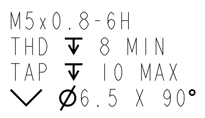
An example of such a note follows:

annotation_example_bjyiqh.png
 
Replies continue below

Recommended for you

We use the "font" font too (such imaginative naming, been that way since PTC's crust cooled). I'm not seeing that behavior in Creo 4 M020. What build are you using?

----------------------------------------

The Help for this program was created in Windows Help format, which depends on a feature that isn't included in this version of Windows.
 
Is the text all the same color on the screen? PTC controls printed line weight via color.

----------------------------------------

The Help for this program was created in Windows Help format, which depends on a feature that isn't included in this version of Windows.
 
Yes, it's all the same color on screen. It actually looks this way on the screen as well, so this isn't one of those "everything looks great until I go to print it" deals. Here's an on-screen example:

onscreen_example_onbw0c.png
 
Can you check the text style of the text & symbols character by character? Looks like thickness is getting applied to the symbols for some reason. Not sure how that can happen accidentally. Maybe some config setting? I must admit I have not kept up with all the config changes since they went from Wildfire to Creo.

Can you open in a different build of Creo to see if it behaves the same?

----------------------------------------

The Help for this program was created in Windows Help format, which depends on a feature that isn't included in this version of Windows.
 
I've tried modifying the text of just the symbol, and they always look like that. I've also mined the full list of config.pro options, and didn't come across anything that seemed like it might help.

Sorry, I can't try it on another Creo build -- this is the only one I have at my disposal.
 
I had this problem recently. The reason why your symbols look thicker is because in Creo 4 they added new support for extended ascii symbols in the form of the ISO or ANSI symbol_font setting. However, these are truetype fonts which have fixed line weight. It looks like your dimension text has a non true type font assigned which means you can modify the line weight via a pen table, etc. Basically you need to match your drawing default font and symbol font to be either a truetype or non-truetype. Do this in the drawing and the model detail settings as the drawing settings only apply to draft dimensions and symbols while the model settings apply to any shown dimensions and symbols in the drawing.

You will also need to change this in your templates or you'll have to do it every time.

Hope this helps.
 
Forgot to mention, you can also set the symbol font to ISO_stroked or ANSI_stroked or Legacy which are all non-truetype and allow you to set line weight. If your default drawing text is a non-truetype then use one of these settings. Change in both drawing and model. Goodluck.
 
Status
Not open for further replies.
Back
Top