GregLocock
Automotive
First a bit of light reading
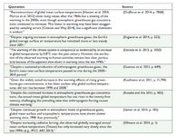
So, all these scientists seemed to think it was a significant event.
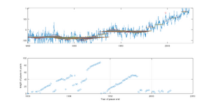
But if they had merely looked at the temperature record and applied a tiny little bit of high school maths they'd have found that pauses are more common than not. But they didn't. In fact since 1950 only a small proportion of the years have been pause free. So the algorithm works by starting with an end date and then finding the start date that results in a 0 slope line. The height of the pause line is the average temperature during that pause. The red dot is the 1998 peak in temperature that anchored the pause that got all the attention. And I'll admit it took more than 10 minutes to write the script for this graph, most of it was turning tables into vectors. Temperature data is HadCrut5 global by month. For the sake of speed I decremented the end date by year instead of month.

Last edited:


