xMeck
Electrical
- Nov 5, 2019
- 9
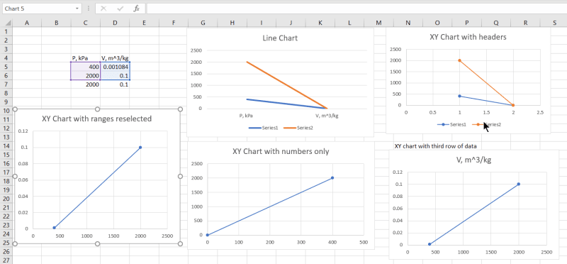
Hi there, So to sum this up excel is confusing the hell out of me at the moment, I am attempting to make a P-v diagram in excel using a small amount of data recieved from a test. I will post what I am currently getting but basically all I need is for the graoh to plot point 1 at 0.001084 at 400kPa and point 2 at 0.01 at 2MPa, literally just showing a straight line but for some reason this is what I am getting and I have no idea why. Any help would appreciated. Pressur eon the x axis and volume on the y axis.
Update: I think I might have just fixed this by switching the data around so that volume is in the left column and pressure is on the right and just using the switch row/column button as I am now getting the correct graph.
Update: I think I might have just fixed this by switching the data around so that volume is in the left column and pressure is on the right and just using the switch row/column button as I am now getting the correct graph.
![[glasses]](/data/assets/smilies/glasses.gif "[glasses] [glasses]") Just traded in my OLD subtlety...
Just traded in my OLD subtlety...![[tongue]](/data/assets/smilies/tongue.gif "[tongue] [tongue]")
 6 selected.