Continue to Site

Eng-Tips is the largest engineering community on the Internet

Intelligent Work Forums for Engineering Professionals

  • Congratulations waross on being selected by the Eng-Tips community for having the most helpful posts in the forums last week. Way to Go!

NX cursor selection

Status
Not open for further replies.

surinderbirdi

Automotive
Jun 14, 2016
31
Why NX doesn't select the parts which is right in front on the screen but instead select the promote/linked bodies buried deep inside an assembly? Is there any way around so that cursor select the part which is shown on the screen not the hidden behind other parts?
its so frustrating. sometimes I yell why NX is so stupid. I understand there is a quick pick option to find part from a list to select. Also I couldnt find any option in "selection preferences" to change it.
 
Replies continue below

Recommended for you

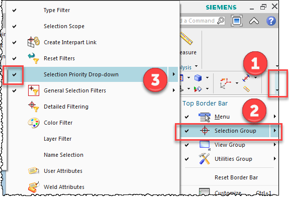
Perhaps your selection priority needs to be set differently. This can be found as a dropdown list of options on the selection bar (or use command finder and search for "selection priority" to find it quickly).

www.nxjournaling.com
 
Three things:
[ol 1]
[li]When it comes to selection, NX is typically only as smart as the person using it (or setting it up) in many cases.[/li]
[li]Learn how to properly use Selection Filters.[/li]
[li]Learn how to properly use Selection Priority.[/li]
[/ol]
You probably have your Selection Priority set for Features to be the top priority. If that's the case, then in the context of an assembly what you're observing is expected behavior (since there won't be many features in an assembly). Type in Selection Priority in the Command Finder to see all of the options - that will help somewhat but using the Selection Filters before you try to select specific objects will probably help the most.

Tim Flater
NX Designer
NX 11.0.1.11 MP8
GM GPDL 11-A.3.4.2
Win7 Enterprise x64 SP1
Intel Core i7 2.5GHz 16GB RAM
4GB NVIDIA Quadro K3100M
 
Thanks @cowski @Xwheelguy I got it.
Xwheelguy, you know what smarter thing would be? combine all individual settings/preferences in one place. Now we have selection settings in "preferences" and selection priority in "edit" menu.
 
I don't disagree with grouping things together but I'm not sure those are actually settings/preferences rather than toggles, just from the way they're arranged now. Would be a subject development would have to answer and require an ER.

Tim Flater
NX Designer
NX 11.0.1.11 MP8
GM GPDL 11-A.3.4.2
Win7 Enterprise x64 SP1
Intel Core i7 2.5GHz 16GB RAM
4GB NVIDIA Quadro K3100M
 
These are "a type of preference" similar to a selection filter, and placed where such should be placed,
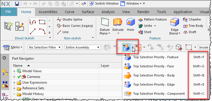
But , by default, not displayed. Note the hotkeys in the image, these are still active despite the pulldown invisible. Maybe you press one of these un-intentional and by that set the priority wrong ?
image_cq2aie.png


image_gmacqv.png


Regards,
Tomas
 
Status
Not open for further replies.

Part and Inventory Search

Sponsor