Continue to Site

Eng-Tips is the largest engineering community on the Internet

Intelligent Work Forums for Engineering Professionals

  • Congratulations waross on being selected by the Eng-Tips community for having the most helpful posts in the forums last week. Way to Go!

RISA 3D V 18 Specific Complaints 10

Status
Not open for further replies.
These are the impressions and the frustrations of 'an old hand' on using RISA 3D V 18 (new risa) for a month now. If it is true that old risa was the most popular frame-analysis program in the USA, then I would say that new risa has done great harm to our profession. The old risa was straightforward, sensible, intuitive, and user-friendly. New risa is none of these things and seems to have been programmed not to make a successful program better or maximize ease-of-use, but ‘change for the sake of change’ (and maximize the number of clicks to boot). The new version has absolutely no regard for engineers who know old risa well – they threw our knowledge into the trash and gave us a shiny new POS that takes us hours and days of wasted time to figure out. In the past month new risa has taken more then twice the time that old risa used to take.
I can’t believe the stupidity of software hiding things and forcing engineers to ‘hunt and peck’ click and click just to accomplish what used to take one click. The hiding of menus and lack of expansion of same, the lack of obvious important buttons is really dumb given the larger screen areas that we have now compared to older computers. Old risa fit many more useful buttons on smaller screens and didn’t ‘bury’ items in menus. It may be elegant in a phone to not know how or where to turn the thing on, but in frame-analysis it is maddening, and if it’s also expensive (as new risa is), you are paying for a mediocre, frustrating to use POS (piece of software). Enough for now, more specific comments later.
 
Not too upset with the GUI, but the program seems to have a huge issue with trying to save and update databases every-time a change is made, which leads to a ton of wasted time waiting on the spinning bar.

“Any idiot can build a bridge that stands, but it takes an engineer to build a bridge that barely stands.”
 
JMarker8489 said:
they threw our knowledge into the trash and gave us a shiny new POS that takes us hours and days of wasted time to figure out.

Tell us how you really feel. LOL

I worked for RISA for 16 years (ending in 2017 when Nemtchuk took over). I was there during some of the development for version 18. Some quick thoughts:
1) It was felt that the RISA interface was "dated" and needed to be updated.
2) The interface was developed not by engineers who were familiar with RISA, but by a group of Ukrainian developers who (for the most part) were not structural engineers.
3) It was supervised by Debbie (now the #2 person at RISA). But, for some reason none of the other experienced engineers at RISA were given a say in what what happening. I found that to be very odd at the time. Maybe the first indication that some of us were getting "pushed out" by the soon to be new management.
4) IMHO the new management is a bit arrogant. I just don't think they respect their customers (and the engineering professing, in general) the way the old RISA did before it was handed over to Nemetschk.
5) I lobbied hard to change things incrementally.... Like replace the spreadsheets with the newer version of the spreadsheets in one version. Then do the 3D graphics in another version after all the kinks had gotten worked out with the spreadsheets. Et cetera. Incremental change is a lot easier for users to take that what was done with the v18 release. However, management didn't want to hear any of it at that point. They were too convinced of their own brilliance.
6) So many people that were important to the effective operation of the company have let RISA. From approximately a year before they took over to now. Javal, Roger, Myself, Mike, Matt, Caitlin, Batman (that's genuinely his last name), and Chris. People who had all been there for years and loved the company back when management cared about the product and their employees.

That being said, I have to also point out that many people felt a similar way about the DOS vs Windows versions of RISA. They were so used to using the DOS version and so efficient with it, that the many users kept their old DOS versions and refused to purchase the Windows version for years. When Windows XP came out (which wasn't nearly as compatible with the DOS version) RISA got a lot of those folks finally upgrading. Something like 5 years after the Windows version of RISA first came out.

Caveat:
There were hard feelings between me and the new RISA management (particular with the new CEO Amber) when I left. So, I am somewhat biased. Furthermore, after spending a year doing mostly healthcare / OSHPD projects for an excellent firm (Spire Structural Engineering), I started working for one of RISA's main competitors Computers and Structures Inc (which makes SAP2000, ETABS, and SAFE). Therefore, you could say that my bias has increased even further. Please understand that the way I interpret the events of my last couple of years at RISA and the motivations of the new Nemetchuk management is potentially distorted by this bias.
 
"Tell us how you really feel. LOL" Hahaha, I do appreciate your humor!
I'll be posting many specific comments on v18, but as you suggest, not all at once.
I mentioned screen size: this morning I measured new vs. old screen and the increase in area was 190%. You would expect new risa to maybe show more information.

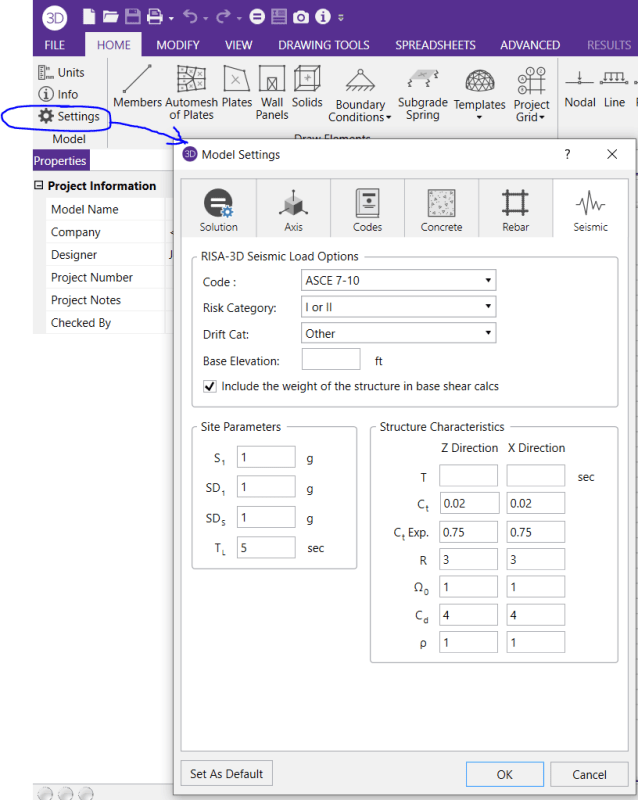
The first box which comes up in new risa is Project Information. In old risa this box was part of Global Parameters and tabs on the box showed Description, Solution, Codes, Concrete, Footings, ALL IN THE SAME BOX. I highlight this because new risa's box just shows what used to be called Description: all the other nice stuff that you want to have access to is hidden elsewhere. Old risa hands will look in vain for the Global button which showed us so much information with one click: it was deleted.

They should've showed even more tabs on the box than old risa gave us, because they had acres of screen available, and they should've highlighted a Global button on the top ribbon.
 
In version 15-ish RISA started changing the term from Global Parameters to Project Settings. Making the program a little more similar to what other programs (Microsoft?) do. I remember insisting that we not change the icon. And, that we refer to it as "Global Settings" or "Global Project Settings" as a transition to the new term. And, that's how it was done. No complaints about it in those versions.

Not sure why they felt the need to pull Project Information out of the Project Settings. But, Global Parameters is mostly replaced by the Project Settings now. You probably already know this:

image_o68vcl.png


Footings got removed, of course, because they got rid of that program. My thinking is that they want you to push users to the more expensive RISAFoundation now.
 
JMarker8489 (Structural)

I am exactly the Ukrainian programmer who made the version RISA 3D V 18. Your posts are not very specific and offensive and look more like a blunt hitting than constructive criticism. This version was made in accordance with the latest trends in programming and user interface. Your account is more like trolling. I fully support the opinion JoshPlumSE (Structural)

Best regards,
German Shabanin.
 
Hi, dear JoshPlumSE (Structural)

Do not make excuses to JMarker8489 (Structural). I support all your comments and agree with them. I strongly disagree with JMarker8489 (Structural) stupid remarks.

Best regards,
German Shabanin.
 
German -

Glad to have you on Eng-Tips. I wish I got a chance to work with you when I was with RISA. But, I worked more with the RISAConnection team, not the team working on RISA-3D.

Based on my years worth of Tech Support experience let me make a couple of comments to you:

1) Users are our end customers. They make our business successful. And, I try to always communicate with them. Even when they are upset and a bit aggressive.
2) Having used software as a design engineer in the past, I know how frustrating it can be when you are struggling with it. This is true with ANY software, of course. So, you can probably relate.
3) Having worked as a structural engineer in regular design engineering here in the US, I think I understand some of the day to day frustrations of engineers.
They are usually under tight schedules from unforgiving clients who don't pay them well enough and who may not even respect the work they do. As such, in my opinion, they are allowed to blow off some steam occasionally. So, I try not to take their remarks personally. I think you would be wise to do the same.
3) One of the things I thought was special about RISA during many of the years I worked there was that we tried to be the Engineer's advocate or voice in what we did. Provide them the type of tools they want and need. Make them function in a way that is easy to use, so that it doesn't take a lot of work to learn the interface.
4) I'd listen to them when they complained and really try to understand why they were complaining and what we could do to make life easier for them. Sometimes the core frustration would be something we didn't have direct control over.... Frustration over increasingly complex material design codes for example. But, even then, there were things for me (and the company) to learn from their frustration.

A good example is this first complaint of his. Global Parameters gets a name change and the Project Info gets split apart from it. What can we learn from this?:
a) Understand the frustration that users feel when the interface changes greatly from one version to another. They don't generally have the time or budgets in their projects to accommodate learning a new interface. So, while changes may be needed, we need to be cautious about how much changes at one time. And, we need to have "anchors" between versions. By that I mean we need to maintain certain core parts of the interface that they can rely on. Parts that make them FEEL as if the changes are not that much. Changes that make the transition between versions easier for the end user.

Honestly, I think this is one if the main problems RISA has right now. Not enough people with the company that have been there for a long that. That would understand what sort of "anchor" points would make the transition easier for the users.

b) The Project Info isn't really very useful. It does have to be filled out. But, maybe that's not the page that should pop up at start up. Maybe it would be better if the Model Settings is what popped up at the beginning.

c) Maybe it would be better if Model Settings were named "Model Settings / Global Parameters".... at least for a couple of releases. I don't personally have problem with the gear icon, but one solution would be to replace the gear with a globe. It would make it easier for the long time users to find.

d) Lastly, I would personally prefer if the Model Settings / Global Parameters had a tab called Project Info. I don't see a compelling reason to have separated this out. Just one of the little things that makes the interface differences SEEM a lot greater than they really are.

Granted, I have no pull at RISA anymore. Quite the opposite. I think Amber / Debbie would be actively resistant to any ideas that I suggested, even if they would endorse them if they were to come from someone else. So, I'm not listing these things with thought that they'll actually happen. I'm just listing them so that you (and the anyone who reads Eng-Tips) understand the thought process that I think should be taken when addressing issues like this.
 
JMarker said:
I mentioned screen size: this morning I measured new vs. old screen and the increase in area was 190%. You would expect new risa to maybe show more information, but pigs don't fly,

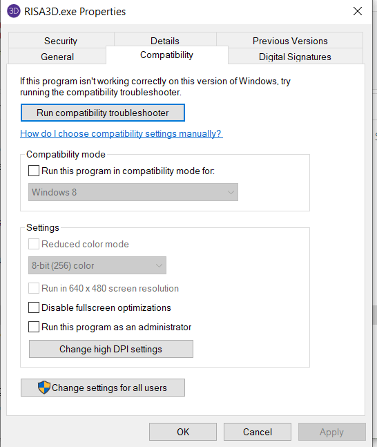
I suspect there is a way to make this work more more like you're expecting. If RISA's tech support is still good then they should be able to give you some guidance on this. My guess if you right click on the RISA executable file itself and select Properties, then you can change some settings to help RISA appear better on your new screen. Probably under "Compatibility". But, I don't know anything for sure anymore. It's been about 3 years since I left RISA, so I'm not up on their tech support. And, I've barely ever used this new version.

RISA_Properties_compatibility_ovrx5l.png
 
In the post above we covered how v18 eviscerated the Project Information box (call this Item 1 of specific complaints). The next post will be Item 2, about the Members (or Draw Members) button. Fortunately, this button still looks like the old button and it’s located on the left side in much the same position as it was in old risa, so it can be found! (yay).

But first, let me address the difference between programming the software and designing the software: programmers have nothing to do with how the finished system looks, or where each menu button is, or what it looks like, and what the menu lines contain. The managers who designed the software are responsible for all of this, not the programmers who are using state-of-art coding techniques to accomplish what the managers told them to accomplish.

It is the managers who should’ve realized how ingenious old risa was at showing twice the amount of information in half the screen area, and how this old system could’ve gotten even better with today’s bigger screen areas. It is the managers who could’ve put some AI (artificial intelligence) into the system to help save the user some time and aggravation: say, when you are drawing members using the Member button. But I’ve gotten ahead of myself . . .
 
I may be the minority here, but I actually love the V18 interface much more than previous versions. Granted I am a younger engineer than most in the office. It seems more in line with how Revit works and maneuvers. This is really useful to me because I am essentially working between the two programs all day. I am really looking forward to Floor and Foundation integration into the V18 package. My hope is that they are keeping it until they make it as seamless as possible. The speed increase when I upgraded from 18.0.4 to 0.5 kind of proved to me that RISA is truly working through most of the bugs.

One thing I'd like to see with V18 is the custom shapes database errors fixed (it warns me each time at startup especially with shapes from RISA Section). It also seems it takes a bit longer to initialize and pull the license from the cloud than prior versions, but granted, it is still significantly faster than Revit.
 
Dear JMarker8489 (Structural)
I partially agree with your message - JMarker8489 (Structural)(OP) 6 Oct 20 06:03
"Responsibility of project managers..." UI disigners.
So what does it have to do with simple programmers - code developers?
I and the whole team of Kiev developers honestly wrote the code,
used the most modern technologies and software - architectural solutions.
The managers (including JoshPlumSE (Structural)) made a decision and told us how to do it.
Why blame programmers stupidly?
Perhaps Bruce and Debbie are to blame for the end result?

Best regards, German.
 
Dear, TOLstryk (Structural)
Thank you very much for the appreciation of the work of the Kiev development team.
Best regards,
German.
 
TOLstryk said:
I may be the minority here, but I actually love the V18 interface much more than previous versions. Granted I am a younger engineer than most in the office. It seems more in line with how Revit works and maneuvers.

Thanks for sharing....That's a very good point!

My guess is that's the most likely strategic reason why the interface changed so much. I think the RISA/Nemetchek management fell hook, line and sinker for the concept that Revit (and the Revit interface) was the future. So, they probably wanted to mimic its concepts as much as possible. To make it easier to move back and forth between the programs.


Item 3. Print Report.

Without a doubt, the way new risa has handled this is some of the dumbest software decisions I've seen in 50 years of wrestling with engineering software; it is completely unfriendly to the user that wants to get something done quickly.

Instead of listing every Available Section and giving the user freedom to choose which ones they wanted, the geniuses hid every GD choice, making the user click through a god-awful long list of items. This procedure should be added to the list which the CIA uses to drive people out of their minds.

If you go the other route (listing 18 pages of All Input and Output items) and expect to be able to easily delete Current Sections in Report you don't want (like you could easily do in old risa), boy are you in for a surprise - there is NO WAY to sensibly and quickly delete pages of stuff.
Modern programming would've allowed the user to use a recent invention called mouse RT. CLICK to DELETE, and even LT. CLICK to SELECT several items and then DELETE with one click.
Apparently no thought was given to being able to use Saved Templates from past risa versions, or to offer any sample Reports.

So to sum up the Print Report function: old risa with it's dated look and ancient code was far-and-away superior to new risa.
 
Josh quote: "I suspect there is a way to make this work more more like you're expecting."

Thanks for the suggestion, but I've no faith in MS Windows ability to do that without destabilizing my whole system. They can't even get upgrading from W7 to W10 right, never mind adjusting risa code . .
 
I suspect there is a way to make this work more more like you're expecting.

I believe I misinterpreted your complaint. I though you were talking about a scaling issue. Where not as many icons or such were appearing as necessary. Or, the program appeared to big or too small on your screen relative to other programs. If that were it, then there are some settings that Windows allows you to modify for that program ONLY in order to make certain programs more compatible with the newer versions of Windows.

That's probably not what you're dealing with though. You were, I believe, complaining that all the toolbars in the old RISA (which gave you easy, one-click access to a number of features) are gone.
 
Item 2. Draw Members.
Push the Member button in old risa and a tabbed box would come up with a remarkable amount of information and choices. The user could move the box to anywhere on screen they chose.
Push the Member button in new risa and a cheap fixed menu called Properties appears on the far left. I say cheap because you’ll need to pay by clicking many times to get information which old risa’s box gave you in one click. New risa has 11sq in of blank screen under their menu and yet chose to hide all the Material Types in a fold-down menu! which leads to even further fold-down menus. Instead of direct access to 6 materials and their Section Sets which old risa gave you in one click, new risa wastes one’s time by doubling the number of clicks.

If you click on a Member in the model, old risa would show an Information box which here again showed you everything you wanted to know. New risa only shows you General Properties (which don’t even include the I joint and J joint, the length, or the axis rotation). Don’t be lazy, you just need to click further to find out all this stuff that old risa showed you by default!
And as for Member Rotation, couldn’t this essential task have been made any easier than it is in old risa? for instance, mouse rt. click, menu item : rotate 90 degrees (and no, I don't need rotate -90 degrees)

I mentioned the lack of AI in new risa: if someone has put Shapes in the Section Sets, why waste their time showing a W8x10 default? I don't know, maybe even assume the user wants to use the shapes they put in Section Sets, and list the first hot-rolled one instead of the useless W8. Better yet, since you have the screen area, why not have all the section sets for every material type appear and let the user directly choose which one to draw? (no . . can’t have that . . too much like old risa).

Let’s end this particular item on a positive note: as one might expect of new technology, the graphics and color used in the 3D views of new risa models and the print functions are certainly a welcome advance.
 
Yup, I see exactly what you're saying.... And, I mostly agree. My quick thoughts related to this new draw members utility:

1) As someone else pointed out, it's clear that the project manager was thinking about Revit and how it works. Maybe she likes that interface better than RISA's. So, her goal was to make RISA's as close to Revit's as possible. Keep in mind that this project manager's primary responsibility was Sales and Marketing. Therefore, from that perspective (pushing new sales) this interface may be EXACTLY what they were looking for. That's the danger of letting Sales and Marketing be in charge of the whole company.

2) I would have objected had my opinion been solicited while I was there. Not to the idea that the new interface should be "Revit Friendly", but because the primary concern should (IMO) have been to make the new interface as accessible to previous RISA users as possible. This sort of goes back to my philosophy of incremental changes as a way to transition users when talking about interface changes. Re-invent the wheel if you have to. But, not in a way that forces existing users to learn how to drive all over again.

3) I don't think this new method of dealing with members is eggriously bad. I just think it is just way too different from the previous interface. Bad management decision, bad project management in general.

4) I've heard whispering that the new management is too "dictatorial" that it's the Amber and Debbie show and that others are not allowed to have opinions. Or, their opinions are summarily ignored. This is probably an exaggeration. But, the experience with this new interface certainly suggests that this is partly true. It's definitely true that most all of the senior engineers at the company (other than those two) have left over the last 3 years or so. Could this be viewed as a consolidation of power by a management that's insecure about having knowledgeable, well respected people under them? That's certainly my view of the situation. And, that would (IMO) really reduce the quality of the work the company does.

Caveat: As I've stated before, I'm obviously biased as a result of my hard feelings from when I was pushed out by Amber. I will always have a soft spot in my heart for the old RISA Technologies that I worked for and the people there. But, this is a very different company now and I certainly resent the way they (new RISA management / Menetshek) treated me and what they've done to the company and the way it treated its long time employees.
 
Josh, I do appreciate all the background information that you've provided. However, I can't understand your "I don't think this new method of dealing with members is egregiously bad."
Software should make life easier, not more frustrating. We are talking about a menu with many branches (a tree-menu), so what is the problem with showing the whole tree? (like a site-map of a website). I could sketch out a tree-menu of the Member Properties in about 15 minutes that would give the user one-click access to every item in the present fixed-menu.

The new risa Properties menu is simply stupid, much like the traffic-lights in my town that are still connected to 100yr old gears, and that still turn red at 2am in the morning even if no-one is on the road - ie, truly dumb in this day-and-age of smart devices and 'green technology'.

New risa should've at least given the user the option to 'expand all menus', esp the Draw Members and Print Report functions.
 
Status
Not open for further replies.

Part and Inventory Search

Sponsor