Continue to Site

Eng-Tips is the largest engineering community on the Internet

Intelligent Work Forums for Engineering Professionals

  • Congratulations KootK on being selected by the Eng-Tips community for having the most helpful posts in the forums last week. Way to Go!

Signature Lines 13

Status
Not open for further replies.

XR250

Structural
Jan 30, 2013
5,293
@Dik and others who have signature lines...

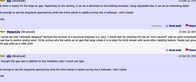
For me, it makes it annoying to follow posts sometimes - especially when the responses are short as I incorporate the sentence into the response I am reading. Are these really necessary?

See the attached thread...

Sig_n1wctk.png


Anyhow, maybe I am just easily annoyed :)
 
Replies continue below

Recommended for you

I did the same thing! Then I was like... I need a signature line. I think the forum should always add a divider to make it clear that the post is over and now it's a signature. It did on his second post in your screenshot... not sure why it didn't on the first one.

- Molly Richardson, EIT (awaiting PE licensure)

“The Enemy of the best is the good. If you’re always settling with what’s good, you’ll never be the best.“ --Jerry Rice
 
if you edit a post the horizontal rule is removed from the post eliminating the visual division between post and signature.

I'm making a thing: (It's no Kootware and it will probably break but it's alive!)
 
I made mine in italics to emphasize that it's not part of my responses.

Please note that is a "v" (as in Violin) not a "y".
 
The OP makes a valid point.[ ] Some possible remedies:
» Best would be for Site Management to rectify the problem described in (and illustrated by) Celt83's 13Oct@19:48 post above.
» An alternative would be for signature-inclined participants to structure their signatures so that their names come before their quips (as per AvengerMolly above).
» WinelandV's use of italics also has merit.

However to be fully effective any approach will need to be universally adopted, so my vote is for #1.

Hopefully (??) "Site Management" will pick up on this.
 
XR250 said:
For me, it makes it annoying to follow posts sometimes - especially when the responses are short as I incorporate the sentence into the response I am reading. Are these really necessary?

I agree completely and that's precisely why I eliminated my own signature sometime back. Signatures detract from readability in a forum and, for that reason, I now consider it a bit of a faux pas to have one.

If we are going to have signatures, they should be short and placed just to the right of our usernames where:

a) It takes up no vertical space needlessly and;
b) It would never be confused with the body text.

This setup would also allow users to still advertise a bit if they have websites etc. I'm cool with that so long as it doesn't detract from readability. Really, this is the only useful purpose for signatures in my opinion.
 

You likely wouldn't have liked the one it replaced, either... It was in an eMail sent to me by my son and I liked the pithyness of it; I paid him $20 to use it. I've attached a copy of my eMail signature line; it's different.

Clipboard01_jyautr.jpg


So strange to see the singularity approaching while the entire planet is rapidly turning into a hellscape. -John Coates

-Dik
 
Revised it so it's not so confusing perhaps...

-----*****-----
So strange to see the singularity approaching while the entire planet is rapidly turning into a hellscape. -John Coates

-Dik
 
dik said:
-----*****-----
So strange to see the singularity approaching while the entire planet signature is rapidly turning into a hellscape. -John Coates

-Dik

[tongue]
 
dold said:
I made mine in italics to emphasize that it's not part of my responses.

How did you do that? HTML script or something? I think that it would be a huge improvement if signature text was at least a different color from body text.
 
Self said:
How did you do that? HTML script or something?

Oh baby, look at me solving my own problems like a big boy.

I formatted some HTML text right here and then just copied that into my signature field in my profile.

All signatures, like all custom license plates, are pretentious. If you're going to force the whole world to look at something in perpetuity, it had better be seriously awesome (hint: it never is).
 
KootK (Structural) said:
How did you do that? HTML script or something?

[i_]Text to be italicized here. Just remove the underscore behind the "i" in the first set of square brackets[/i]

You can replace the "i" with "b", "u", and "s".

Bold, Underline, Strikethrough

Edit: And there ya go beating me to the punch.
 
Koot said:
How did you do that? HTML script or something? I think that it would be a huge improvement if signature text was at least a different color from body text.

Forwarding you to @winelandv

Colorized signatures do seem to be an improvement though. Hopefully we do not experience the Streisand Effect due to this thread.
 
It's brilliant winelandv. I don't know how that potential escaped me before.

In all seriousness, how's this for a signature font that is diminutive, as it ought to be? I'm still going signature less but, for those committed to signatures...

This is blue, italicized, and subscript. Next best thing to gone.

[sub]All signatures, like all custom license plates, are pretentious. If you're going to force the whole world to look at something in perpetuity, it had better be seriously awesome (hint: it never is).[/sub]
 
Bravo, KootK. Solves the issues of readability while leaving the option for people to use it effectively (as many do).
 
KootK said:
All signatures, like all custom license plates, are pretentious. If you're going to force the whole world to look at something in perpetuity, it had better be seriously awesome (hint: it never is).

LOL. Love that take on them.

I tend to think of signatures as personal "branding". We all have standard signatures on our e-mails. Because we want whoever we're communicating with to get our basic info (phone, address, company name, company motto or whatever).

For here, it's like a personal "motto" or life quote. Some people want to announce that they're Christian (or Jewish or Muslim). Some people have a . I've got my important info (name and engineering discipline) right in my UserName.

PS, I love the idea of KootK keeping that quote about the pretentiousness of signatures as his personal signature (in the blue, italicized subscript)! That would be my kind of humor. [wink]
 
how about over there, out of the way >>>
Better yet would be to have an option somewhere to just hide signatures. Browser extension?

[sub]how about over here, out of the way?[/sub]​
 
JP said:
PS, I love the idea of KootK keeping that quote about the pretentiousness of signatures as his personal signature (in the blue, italicized subscript)! That would be my kind of humor.

Right, like I need to be more of a magnet for confrontation.

I get the personal branding thing and the desire to interject a little levity into otherwise mundane situations (posting on a forum, sitting in traffic). I was mostly just being facetious other than the readability part.

One aspect of signatures that I would genuinely like to banish, however, is anything that conveys professional status. My reasoning is this:

1) If you're an EIT and you say that, you're just inviting folks to devalue your comments unecessarily. Maybe you're a bitchin' EIT.

2) If you're an SE in 42 states and six countries and you say that, it kind of feels as though you're throwing your weight around a bit. Maybe you're a useless SE in 42 states, stranger things have happened.

This, perhaps, weighed against any genuine benefits accrued by actually knowing something about the qualifications of the person with whom you are conversing and tailoring your comments accordingly.

In space like this, my preference is mostly for complete anonymity. Let all be judged on the reputations that they establish right here.
 
@winelandv:

Given the persistent confusion over your handle (wine lady etc), why not just change it to wineland and dispense with your signature? Already taken? The "v" is dear to you somehow? The existing form is your user name lots of places? Do tell. Also, what on earth does the "v" stand for?

I switched my handle from KootenayKid to KootK because:

a) I'm one old ass kid at this point and;

b) The original was clearly too much typing. Bizarre abbreviations ran rampant.
 
KootK said:
In space like this, my preference is mostly for complete anonymity.

That's a bit unexpected coming from you. Your email address is in your profile, and half of us know who you are and are connected with you on LinkedIn.

I don't put my name on here because I don't want Google to snag some post from when I was new (or even now...) asking some really simple question and having a prospective client find it and pass me over as a result.
 
Status
Not open for further replies.

Part and Inventory Search

Sponsor