Continue to Site

Eng-Tips is the largest engineering community on the Internet

Intelligent Work Forums for Engineering Professionals

  • Congratulations KootK on being selected by the Eng-Tips community for having the most helpful posts in the forums last week. Way to Go!

Drawing Font

Status
Not open for further replies.

jerry1423

Mechanical
Aug 19, 2005
3,428
Back in the good old days blockfont was a very common drawing font.
Things have changed over the years, and so has the drawing font.
Does anybody have any suggestions on a good font for NX drawings?
I would like them per ISO standards.


Jerry J.
UGV5-NX1899
 
Replies continue below

Recommended for you

We are using the font Arial Unicode MS.
It was supplied by Microsoft office before the Office365 generation.
I was reading the standards very carefully and came to the conclusion that there is nowhere stated how the characters should look/appear, only that they should be easy/clear to read and suitable for copying. ( and suitable for microfiche which probably could be ignored 2022.)Apart from this I did not find any "true rules".
The Arial Unicode MS differs from the "Arial" in that it contains several other language specific characters.

Regards,
Tomas

The more you know about a subject, the more you know how little you know about that subject.
 
Personally, I prefer Helvetica, but if you're running on Windows, it may not have come with the OS. And it's a proprietary font that has to be licensed. While this may not mean much for NX, Helvetica comes standard on a Mac (Apple paid the license fee). The font is owned by the Linotype Company that used to make typesetting machines.

A bit of trivia: "Helvetica" is basically Latin for "Swiss".

And if you're a real font geek, there's a feature length documentary titled, what else, 'Helvetica'. I've got a copy of it and it's well worth the time watching it (it can be downloaded from iTunes). And if you like the film, the guy who made it, Gary Hustwit, has two others which makes-up his 'Design Trilogy', despite the fact that they cover three rather different topics. The other two films are 'Objectified', which is about industrial design, and 'Urbanized', which is about urban design. I have all three films and they're very interesting.

And since this thread is about fonts, there's another documentary which is well worth the time and effort, and that's 'Linotype: The Film', by Douglas Wilson (it used to be available on iTunes, but I just checked and it's no longer listed, however the three Gary Hustwit films are still there).

John R. Baker, P.E. (ret)
Irvine, CA
Siemens PLM:
UG/NX Museum:

The secret of life is not finding someone to live with
It's finding someone you can't live without
 
Hello,

I like the Arial Unicode MS as told by Tomas but you need to look if all of your coworkers have the 365 suite. If not you need to manual install this font in each pc.

Gelson Z. Nicoletto
V.18-NX1980
 
It seems that we have lost the ability to use Blockfont with our new installation of NX12 (build 2801). Has this font been discontinued? Or is there something else we can do to restore it to the list of fonts? This also prevents us from using the special characters that are available with Blockfont. [thumbsdown]
Update: It may have been a translated drawing from another CAD system. Has anyone seen this happen? I thought all NX fonts would be available after a translation.

Product Designer: I-Deas/NX/Catia
Automotive Industry
 
I once did a readability poll with all the nearly-retired and otherwise visually-impaired people at a former workplace. Century Gothic was the winner.
 
suskam said:
Update: It may have been a translated drawing from another CAD system. Has anyone seen this happen? I thought all NX fonts would be available after a translation

Years ago we saw some font strange-ness in the I-DEAS to NX "Great Migration" with some of our P&ID/schematics. I think we lost the percent symbols " % " and decimal points (periods). We needed to change the font in NX in order to fix them. It could be that something other than blockfont had been used in I-DEAS, such as military. Now I wish that I hadn't recycled all those notes recently! So, don't feel alone! [bigsmile]

John Baker - speaking of typesetting, you'll probably enjoy this.
Hamilton Wood Type & Printing Museum, Two Rivers, Wisconsin
I haven't been there yet, but there's an interesting movie about it that aired on PBS TV: "Typeface".
 
Suskam said:
It seems that we have lost the ability to use Blockfont with our new installation of NX12 (build 2801).

If this is affecting all drawings, check the customer defaults -> drafting -> general/setup -> miscellaneous -> fonts to use option; it is possible to restrict the use of the NX fonts.

www.nxjournaling.com
 
What a great topic, there are many different studies on fonts. When we switched from I-Deas to NX we needed to update our font standard. We decide to use the Tahoma Font. When choosing a font, many different things are taken into consideration. Like toner use when printing, ease of copying, and many other factors. This amazed me when we started to look into fonts.
One of the small reasons we used Tahoma, is because you can hit the letter T when changing fonts and it goes straight to Tahoma.
 
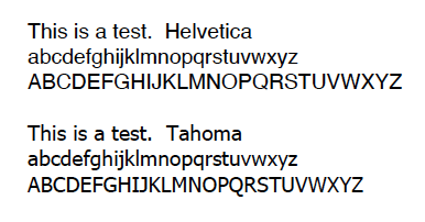
Tahoma appears to be similar to Helvetica except for the upper-case I, J and Q, and since it was developed for Microsoft, it obviously will be available on all Windows machines, so NX is covered (BTW, Tahoma is also included with the Mac OS).

A sample is below:

Screen_Shot_2022-10-27_at_1.08.55_PM_thxwk8.png


But as you noted, it is a bit more compact, at least in terms of the upper-case letters, so it probably would use less ink/toner in the long run.

John R. Baker, P.E. (ret)
Irvine, CA
Siemens PLM:
UG/NX Museum:

The secret of life is not finding someone to live with
It's finding someone you can't live without
 
Status
Not open for further replies.

Part and Inventory Search

Sponsor