Eng-Tips is the largest engineering community on the Internet

Intelligent Work Forums for Engineering Professionals

Font size on drawing 1

Status
Not open for further replies.

DoubleStud

Structural
Jul 6, 2022
453
0
0
US
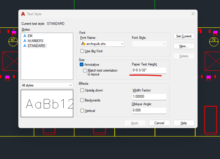
What do you all use for your font? The company I used to work for uses 1/8" on AutoCAD. FYI font size on typing programs are all in 1/72th. So 1/8 is equivalent to size 9. I feel like it is too big. I started using 3/32 (6). I feel like it can even be smaller and maybe do 1/16 (4.5). Sometimes it is hard to fit everything with bigger texts. What are your experience? What the smallest you would go if you do a lot of 24x36 prints for the field?
 
Replies continue below

Recommended for you

In my office, we (the industrial side) use 3/32" as the standard font size. The commercial side of our office uses 5/64".

Please note that is a "v" (as in Violin) not a "y".
 
DoubleStud,

I have set up our CAD prototypes in our mechanical office with two title blocks.

[ol 1]
[li]A size with 2mm lettering[/li]
[li]B size with 2.5mm lettering[/li]
[/ol]

These are printable on letter size and tabloid size printers. They are completely viewable on computer monitors, including those of cheap laptops (1366[×]768). I did lots of E[ ]size drawing back in my drafting board days. Do you have work benches that fit them?

--
JHG
 
XR250, I am having problem with my text style. If I use anything other than simplex font, my special characters like CL (center line), PL (property line) show up as a different text (small and thick). I really want to change my font style though!
 
For what its worth, the way Word measures text size is different from CAD. Google search for how fonts are measured and you will see some diagrams that show the way typesetters measure font size. Basically, a 12pt capital A in word is a good bit less than 12*1/72 inches, but if you measure a capital A in Revit, it is the size of the text height. My un-bought-out company used 1/8" arial narrow for drawings (so that we could read it okay on 11x17 half-ish scale drawings). The conversion we found for that scheme is around 12.6 pt font in word prints the same as 1/8" text in revit. For the plugin we use, we found that 13pt was close enough. The new company uses 3/32" Arial (that is consistent with what school said the standard font should be). That conversion is 9.5pt.
 
For 8.5x14" drawings, I use 3/32" for titles and 5/64" for all other text.
I would expect it to be bigger on 24x36" prints.
We very seldom work with anything over 11x17, so anything larger gets reduced accordingly.

DS- there are settings that affect how that is displayed, AutoCAD is not locked into 8ths.
 
Robert, your comment about reading it OK on 11X17, are you saying printing the larger 24x36 and make it fit on 11x17 paper? So printing it not to scale? I am using annotative scale so the text is same height regardless of paper size. Your comment is regarding people not using the right paper size?
 
For AutoCAD (24x36 and 22x34 drawings, typically printed half size on 11x17), the places I have worked have all used the following convention:
Standard text is RomanS font with a height of 3/32"
Minor titles are RomanS with 1/8" height
Major titles are RomanD with 3/16" height.​
 
Architectural Graphic standards: 2.0mm = small; 2.5mm = medium; 3.0mm = large. I like 3/32" or 5/64" for most text. At half scale I could read them at one time, but now, my eyeballs are not as good.

If you set your units you can get CAD to list the text size correctly.
CAD_d5uxft.png
 
No, I was saying that we generally print our sheets for internal use in the office as 11x17. It is scaling the full-size ARCH D or ARCH E1 sheet to 11x17. Our text is set to be 1/8" on the full-size sheet, so when we print that out on 11x17 (46% for D sheets and 36% for E1 sheets) we can still read it okay (or mostly okay)
 
As another data point, we're also running standard text at 1/16" on 11x17 (or 1/8" at full size), which comes out very closely equivalent to about 7pt Open Sans Semicondensed for other software. Titles double that, or 13pt.

I'm pushing hard to get us moved away from the tyranny of RomanS and Romans-A. We'll see how that goes.
 
Arial 5/64 is my standard and deja vu sans mono if I need columns to line up...

-----*****-----
So strange to see the singularity approaching while the entire planet is rapidly turning into a hellscape. -John Coates

-Dik
 
if you print them to paper (what an idea in this day and age!), would someone who is reasonably hard of sight be able to read them, with glasses?

thats the cutoff for me.

i prefer size 10 minimum. i have a client that likes size 6, i dont understand why.
 
This is sort of related, but how does everyone set-up their text preferences in AutoCad to make sure their text comes out the right height on the sheet?

My previous job had a bunch of preset text sizes in model space that you chose based on whatever scale you were plotting (or planning to plot) in. That becomes a pain when you change your viewport scale at any point and have to re-do every note, leader, and dimension on that particular plan/ detail.

I'm trying to setup a quick and easy system for myself now.

My preference is Times New Roman. Very clean, I can't stand RomanS anymore.
 
jerseyshore said:
This is sort of related, but how does everyone set-up their text preferences in AutoCad to make sure their text comes out the right height on the sheet?

I learned CAD at a civil firm, so I'm a bit odd:

I use viewports in paper space. I draw my model, and then write in paper space over top of the view port. If I have to change scale, there some adjusting of text, but I don't have to go into the properties of each one and modify it. But I rarely have to do that because I generally lay out everything before I start annotating. So I know how my plan will fit on the sheet before I start.
 
Jerseyshore -- the simplest (ha!)one way is to use annotative scales for any objects which exist in model space but should be consistently sized in paper space. Match the annotative scale property to the viewport scale.

The benefit of this method over what Pham describes is that you don't ever get separation between the model linework and annotations if things move in the future. Although I know others who do it that way also.
 
Status
Not open for further replies.
Back
Top