Continue to Site

Eng-Tips is the largest engineering community on the Internet

Intelligent Work Forums for Engineering Professionals

  • Congratulations KootK on being selected by the Eng-Tips community for having the most helpful posts in the forums last week. Way to Go!

The Lancet pulls a fast one 10

Status
Not open for further replies.

GregLocock

Automotive
Apr 10, 2001
23,260
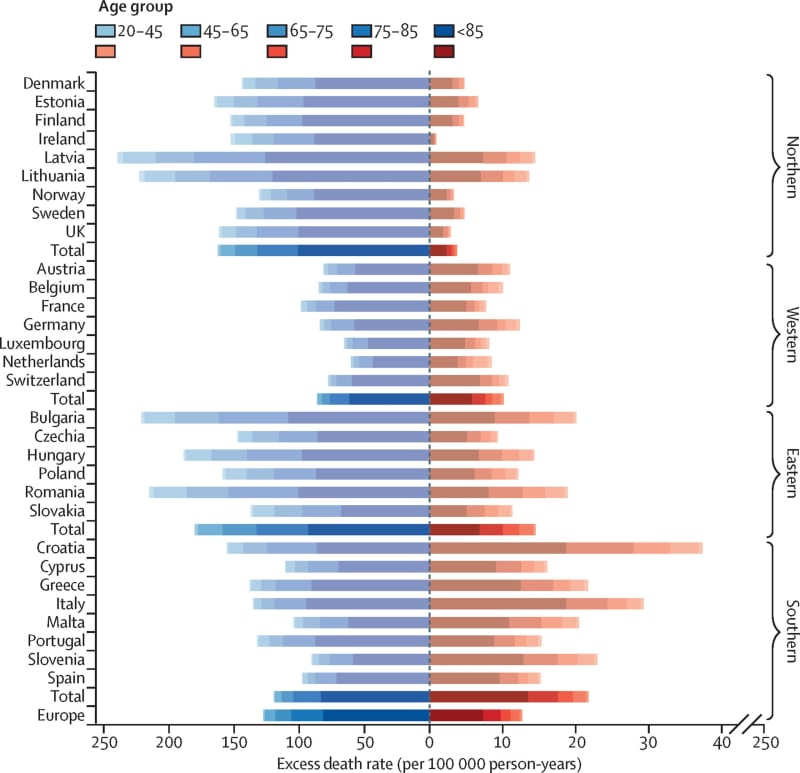
The Lancet's graph of temperature related deaths. Spot the problem!
Lancet-heat-and-cold-deaths-scaled_sa0gfm.jpg

The x axis uses different scales for hot and cold. Disgusting

Cheers

Greg Locock


New here? Try reading these, they might help FAQ731-376
 
The end result is that they are still dead... only looks worse...

-----*****-----
So strange to see the singularity approaching while the entire planet is rapidly turning into a hellscape. -John Coates

-Dik
 
Perfect example of what Sir John Brignell of Numberwatch called "Chartmanship"

The problem with sloppy work is that the supply FAR EXCEEDS the demand
 
No excess death rates shown for older populations in each country, just for the totals. Distorted picture.
 
oh c'mon dik! The scales are clearly meant to exaggerate the deaths due to hot temps. Cold temps kill people, mostly because government policy has made energy very expensive in the UK (and in Europe).

I guess the graph is saying that the health care systems (and measures for dealing with climate extremes) are better in Norway than the UK (or anywhere else in "Northern Europe"
and that Northern Europe has more cold weather then Central Europe.

"Hoffen wir mal, dass alles gut geht !"
General Paulus, Nov 1942, outside Stalingrad after the launch of Operation Uranus.
 
Hmm, according to CDC there are 600 excess heat related deaths in USA or 0.18/100,000 population.

Who is lying?
 
@dik ... "... and this year is not over" ... what's that got to do with anything ? The data is clearly from some period in the past (unless they're making up future results ?).

"Hoffen wir mal, dass alles gut geht !"
General Paulus, Nov 1942, outside Stalingrad after the launch of Operation Uranus.
 

You're not through the summer yet, and have no idea of what is ahead. The numbers will never decrease (not in zombie land, yet) and will only increase... [pipe]

-----*****-----
So strange to see the singularity approaching while the entire planet is rapidly turning into a hellscape. -John Coates

-Dik
 

The US isn't the only country on earth that is suffering from climate change... take a gander at what is happening elsewhere.

-----*****-----
So strange to see the singularity approaching while the entire planet is rapidly turning into a hellscape. -John Coates

-Dik
 
an interesting article on mortality...

"“Importantly, we used 43 countries’ baseline data across five continents with different climates, socioeconomic and demographic conditions and differing levels of infrastructure and public health services – so the study had a large and varied sample size, unlike previous studies.”

The mortality data from this groundbreaking Monash study is significantly higher than the second-largest study published in 2015, which was based on 74 million deaths across 13 countries/regions and estimated 7.7 per cent of deaths were related to cold and hot temperatures.

Professor Guo said that showed “the importance of taking data from all points of the globe, in order to get a more accurate understanding of the real impact of non-optimal temperatures under climate change”.

Of the global deaths attributed to abnormal cold and heat, the study found:

More than half occurred in Asia, particularly in East and South Asia
Europe had the highest excess death rates per 100,000 due to heat exposure
Sub-Saharan Africa had the highest death rates per 100,000 due to exposure to cold"


-----*****-----
So strange to see the singularity approaching while the entire planet is rapidly turning into a hellscape. -John Coates

-Dik
 
That is a good report, except for the summary at the top, where it says that global warming will increase temperature deaths. It reports an increase in deaths from high temperatures, but a much greater decrease from low temperatures. By my sums, the report itself says that worldwide, or at least in the countries they reported on, there were some 6.19 million deaths from cold, and only 637000 from hot. How could rise in temperature fail to decrease the net death rate from temperature? This study, a good Australian one by the way, has destroyed your theory.
 
@dik ... "You're not through the summer yet, and have no idea of what is ahead." but that's not the point of the graph. The graph presents some existing data. No one knows what this year holds ... maybe higher, maybe lower (than the previous year). The graph is gamesmanship, clearly trying to hide a key conclusion of the data.

"Hoffen wir mal, dass alles gut geht !"
General Paulus, Nov 1942, outside Stalingrad after the launch of Operation Uranus.
 
It's not my theory. It's just information.

-----*****-----
So strange to see the singularity approaching while the entire planet is rapidly turning into a hellscape. -John Coates

-Dik
 
@dik ... "theory" ? who's talking about theories ?? I'm talking about a graph

I agreed with other posters, than the graph is "gamesmanship".

Your reply was "... and this year is not over." What does this have to do with the graph misrepresenting the data (the data existing prior to the graph being created, not some future data).

Do you defend the way how the graph presents the data ?

"Hoffen wir mal, dass alles gut geht !"
General Paulus, Nov 1942, outside Stalingrad after the launch of Operation Uranus.
 
Sorry rb... it was in response to Hokie's comment.

No, I don't defend the way the graph's presented. Data should be shown clearly...

I have a problem with people referring to the current state as being the new normal. For this to happen, things have to be static. You cannot refer to something in a state of flux as being the new normal. We have to see where this will end, and like marriage, for better or for worse.


-----*****-----
So strange to see the singularity approaching while the entire planet is rapidly turning into a hellscape. -John Coates

-Dik
 
yeah, well your comment still doesn't make sense to me.

and I'm not so sure about Hokie's ... very few countries show 5 colour bands (Latvia, and a couple others, on the cold side). I read the graph as saying there are few deaths in the youngest band. And they made it harder to read, but showing the totals as darker than the individual countries.

"Hoffen wir mal, dass alles gut geht !"
General Paulus, Nov 1942, outside Stalingrad after the launch of Operation Uranus.
 
These major changes have happened since 2021 why?
 
rb,

My comments were not about the graph, but about the Monash report, which clearly shows that in terms of deaths due to temperature variation, cold is much more dangerous than hot. About ten times worse.
 
The only 'disgusting' thing I see in this thread are the mental gymnastics happening on both sides of the argument to make the chart appear to say what you want it to say.

Maybe hoping that this forum will ever be a place where data-driven discussion and intellectual honesty are priorities for all parties is a pipe dream. Maybe I'm naive.
 
Status
Not open for further replies.

Part and Inventory Search

Sponsor