Continue to Site

Eng-Tips is the largest engineering community on the Internet

Intelligent Work Forums for Engineering Professionals

  • Congratulations KootK on being selected by the Eng-Tips community for having the most helpful posts in the forums last week. Way to Go!

Things are Starting to Heat Up - Part XIII 27

dik

Structural
Apr 13, 2001
25,752
For earlier threads, see:
thread1618-496010
thread1618-496614
thread1618-497017
thread1618-497239
thread1618-497988
thread1618-498967
thread1618-501135
thread1618-504850
thread1618-506948
thread1618-507973
thread1618-510266
thread1618-512015


-----*****-----
So strange to see the singularity approaching while the entire planet is rapidly turning into a hellscape. -John Coates

-Dik
 
Replies continue below

Recommended for you

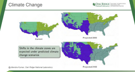
Somebody seems to be taking this stuff seriously..
Well, of course; they're government funded. They are required to perpetuate the climate change crisis narrative. Their continued funding depends on it.
 
Last edited:
GregLocock Said: Colored maps. No idea what the color means. So there will be more blue and less green and a bit more teal. Well up to the usual information free value of your posts.
I was going to say something similar about that map. I might have said it with a little more tact. But, I looked for a definition of what that map meant and couldn't find anything. Then I shook my head and thought "how much of climate science is based off of 'misinformation' dressed up with colorful charts that look meaningful, but really are pointless?"
 
Well up to the usual information free value of your posts.
More to come... it's free. The charts show the likely area increase, of the US, caused by climate change (if it occurs).
 
"The charts show the likely area increase, of the US, caused by climate change ..." Climate change causes the area of the US to increase, is the only way I can parse that. Well that's one of the more benign predictions.
 
I guess we'll have to wait and find out... :)
 
That's a climate zone map.. it has nothing to do with 'the area of the United States increasing', whatever that might mean
 
That's a climate zone map.. it has nothing to do with 'the area of the United States increasing', whatever that might mean
Sorry Swinny... you are incorrect. There are three maps shown. The areas shown are the extent of those areas that may be affected at future dates. It's not surprising that the areas increase in time.
 
dik, you use alot of "may", "if", "could" in your responses. Doesn't sound like you even believe that the problem you're advocating to make massive efforts to solve, actually exists. Of course, anything could happen. Global average temperatures could rise by a several degrees in the next decades; they could also drop several degrees. Do you really think it makes sense to try to alter the temperatures (even if we could, which hasn't been proven either), based on a guess of what may happen years or decades in the future? Doesn't it make more sense to focus our efforts on preparing for the all the foreseeable possibilities of what the climate may do, and more importantly, the numerous more immediate threats to our existence.
 
It's just because of the uncertainty. In my opinion, it is very likely that more serious stuff will happen and what we are encountering is just the beginning. Because of the uncertainty and the politics, little or nothing is being done about it. I can see with your new administration, less will be done. It's just a concern to me.
 
I honestly have LESS idea of what that map means now than when Dik first shared it.

I assumed, like SwinnyGG, that it was a map of how climate zones were predicted to change over time. In fact, looking at that chart, it is captioned as "Shifts in climate zones are expected under predicted climate change scenarios.

But, now you're saying it's related to "area increase". That makes zero sense to me. In fact, your response makes me question your understanding. So, I will try to explain that chart myself.
1731344951366.png

First, I've got to find it. There is a citation attributed to "Jitendra Kumar, Oak Ridge National Laboratory". Well, I still wasn't able to find that chart. But, I found similar enough charts to explain what it means better than Dik's.

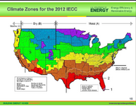
Looking at the better annotated chart below, I will make this interpretation of Dik's original chart.

The greyish blue that covers the south Florida through middle of Texas represents a warm - humid climate zone.
The Purple area represents a hot / dry climate zone.

Not sure that I understand the other climate zones very well. But, my guess is that they are cold and most vs cold and dry. For what it's worth, I put incredibly little value in these sorts of projections.

1731344812084.png
 
Sorry Swinny... you are incorrect. There are three maps shown. The areas shown are the extent of those areas that may be affected at future dates. It's not surprising that the areas increase in time.

That's not correct.

That's very clearly a map of current US climate zones, with projections for how those zones could change over time. It's described that way in the presentation from whence it came.

I'll ask the same question I always ask that you never answer:

What's your actual point?
 
I too, think it's just a representation of how the creators of the map guess/assume the climate zones may change in the future, with the projected assumptions scaled larger, to make it look worse.

The Purple area represents a hot / dry climate zone.
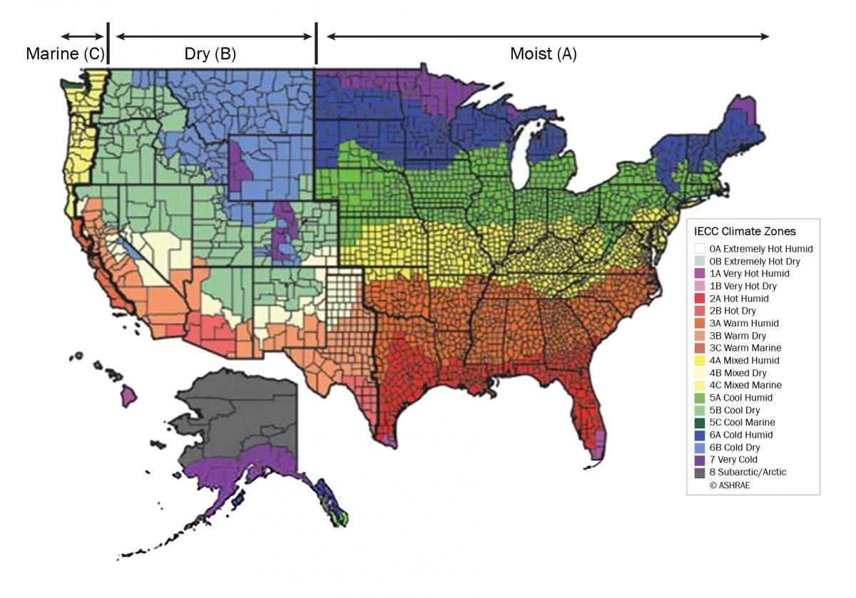
I'm pretty sure the purple (Zone 7) is the coldest. I don't think humidity or moisture is a component of that map. The purple areas in Wyoming and Colorado are the high altitude areas, and are therefore colder than the surrounding areas.
 
JoshPlumSe is talking about the original map posted by Dik - in which purple represents hot + arid.

On your map, purple represents IECC climate zone 7, titled 'very cold'.

Moisture IS a component of that map. That's the IECC climate zone map, which determines all sorts of things code related for building design/construction, depending on which zone you're building in. The one you posed looks to be an older one, but it has the moisture zones marked. Here's one that's a bit newer, with moisture zones marked and all climate zones and sub zones labeled:

IECC_climatezones_2021.jpg
 
They're going in the right direction, albeit a little slow...

 
Things are starting to look up...

"CEO of Denver-based Liberty Energy, Wright is a vocal advocate of oil and gas development, including fracking, a key pillar of Trump’s quest to achieve U.S. “energy dominance” in the global market.

Wright has been one of the industry’s loudest voices against efforts to fight climate change, and could give fossil fuels a boost, including quick action to end a year-long pause on natural gas export approvals by the Biden administration.

Frequently criticising what he calls a “top-down” approach to climate by liberal and left-wing groups, Wright has argued that the climate movement around the world is “collapsing under its own weight.” He has never served in government, but has written that more fossil fuel production is needed around the globe to lift people out of poverty."


whoda guessed...
 
Continues in...
 
Last edited:

Part and Inventory Search

Sponsor